
This summer, I had the pleasure of working as a Data Analyst Intern at Voices.com as a part of my MSc in Business Analytics. Voices.com is a marketplace website that matches business clients with voice-over talent.
During my internship at Voices.com, I became involved in a variety of analytics projects. I committed to a customer segmentation analysis on voice-over talent, analyzed customer churn, built dashboards for core metrics, and designed A/B tests! Through these projects, I procured even more experience with the R programming language. In this post, I will showcase R tips that I learned this summer for data analysis and visualization. Hopefully, you can apply some of these tips to your own data analysis projects.
1. Removing similarly-named objects from R’s Global Environment
Say that you are in the middle of a data analysis and you need to test out a part of your code. If you’re like me, you will test sections of code and assign the results to a new object named something like test. After I’m finished testing my code, I’m left with a RStudio environment that looks like this:

My first tip will allow us to selectively delete these test objects. This is accomplished through the following code:
rm(list = ls()[str_detect(ls(), "string")])
Let’s break down what is going on in this code.
rm()removes objects from the R environment.
ls()lists all the objects in the R environment.
str_detect()fromstringrdetects a specified pattern in a string.
"string"is the pattern which our objects of interest have in common (e.g. “test”).
The innermost part of the code, str_detect(ls(), "string"), detects the specified pattern within the environment. The previous code, enclosed in square brackets, indexes the list of object names in the environment (ls()[str_detect(ls(), "string")]). Finally, that code is entered as the list argument in the rm() function. Ultimately, rm(list = ls()[str_detect(ls(), "test")]) removes objects with the matching "test" pattern from the environment!
2. coord_cartesian() for zooming in on ggplots
Say that you are producing a histogram from your data that looks something like this:
aq <- as_tibble(airquality)

ggplot(aq, aes(x = Ozone)) +
  geom_histogram(fill = customBlue, binwidth = 5) +
  theme_light() +
  labs(y = "Count", x = "Ozone")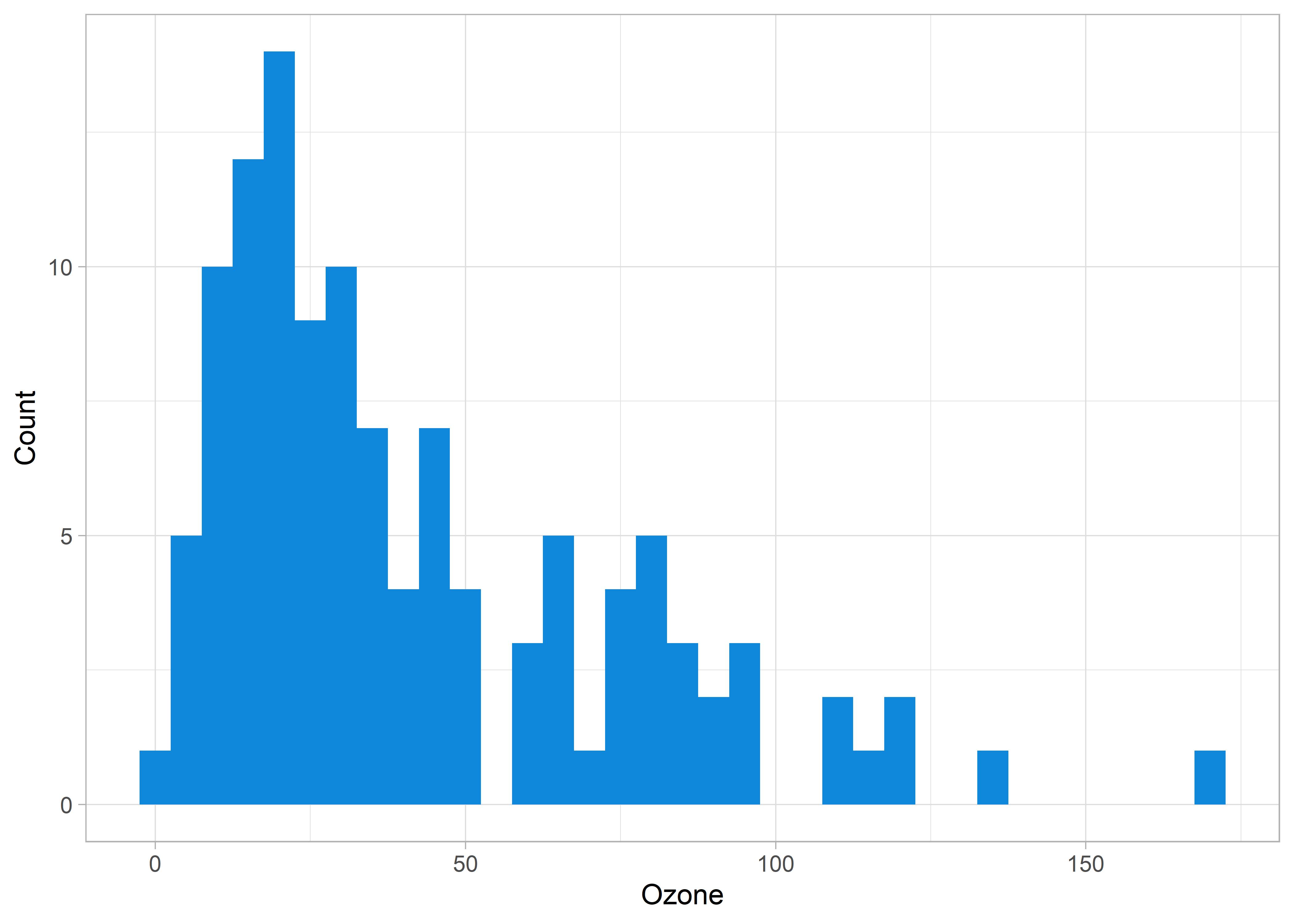
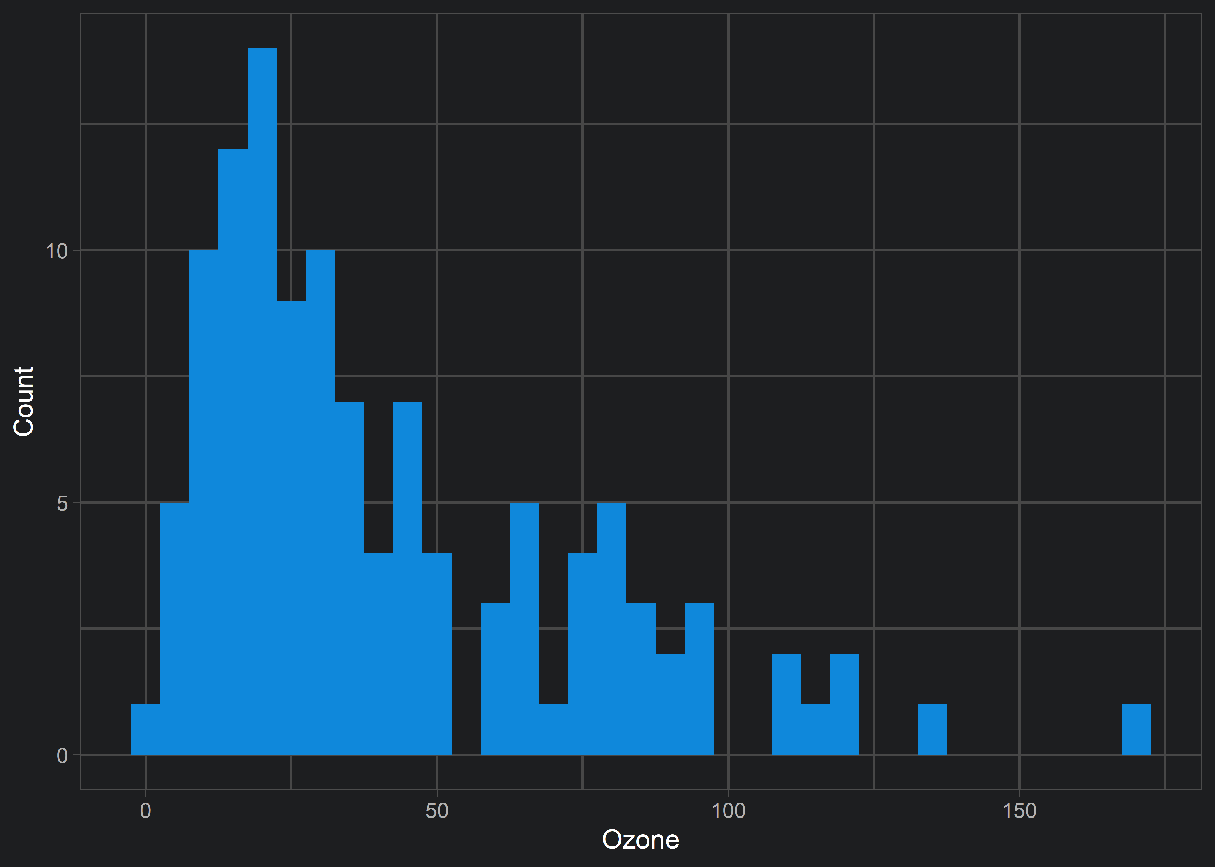
xlim():
ggplot(aq, aes(x = Ozone)) +
  geom_histogram(fill = customBlue, binwidth = 5) +
  theme_light() +
  labs(y = "Count", x = "Ozone") +
  xlim(c(0, 50))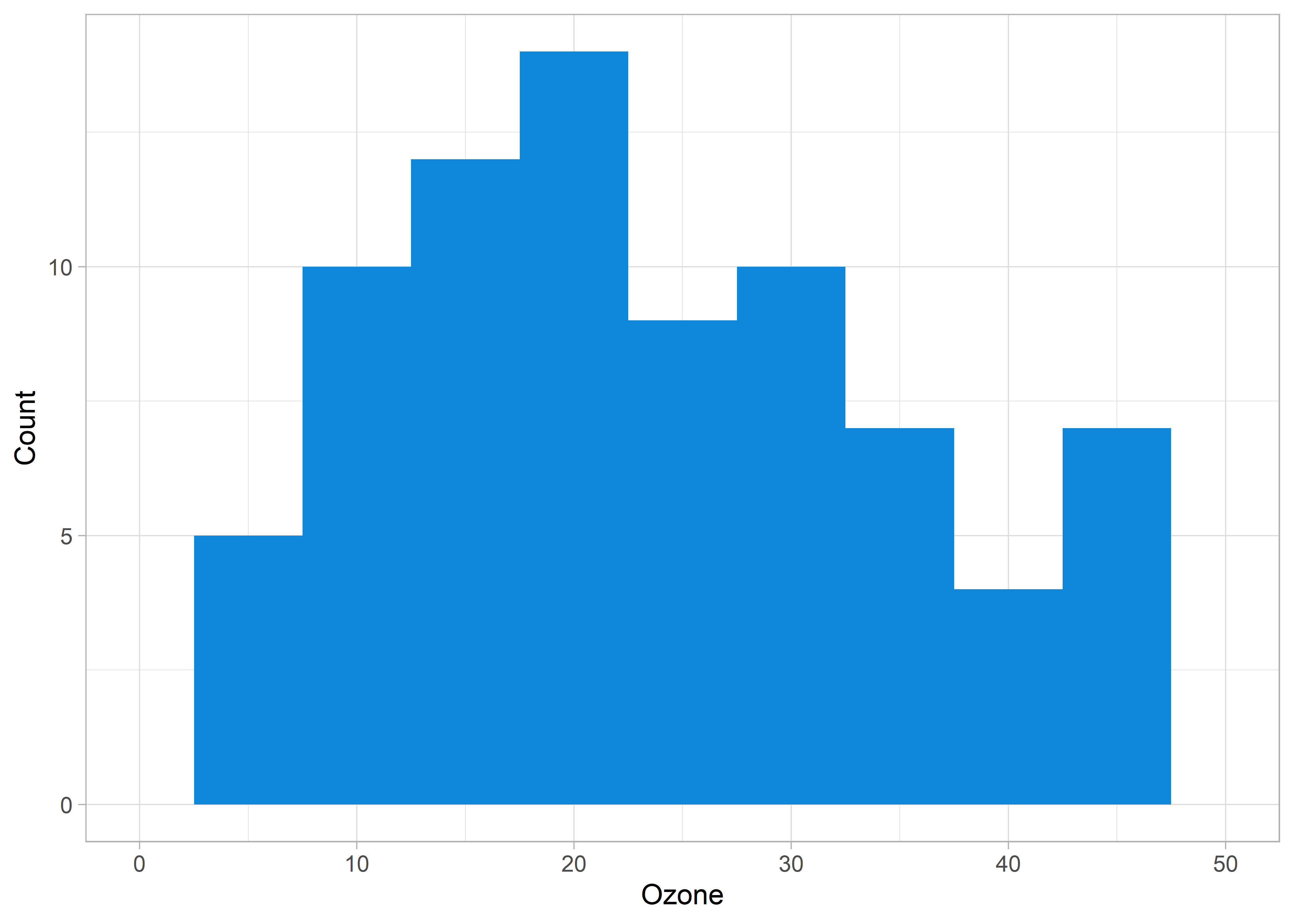
xlim() has resulted in an odd behaviour (note the warning messages). Our histogram looks different than the original above. This is because xlim() (and scale_x_continuous(limits = ...)) has excluded all data that don’t fall within the limits. In this example, xlim() excluded data points near 0 and 50. This is problematic if our goal is to visualize the same data without excluding data that lies on the edge of our criteria.
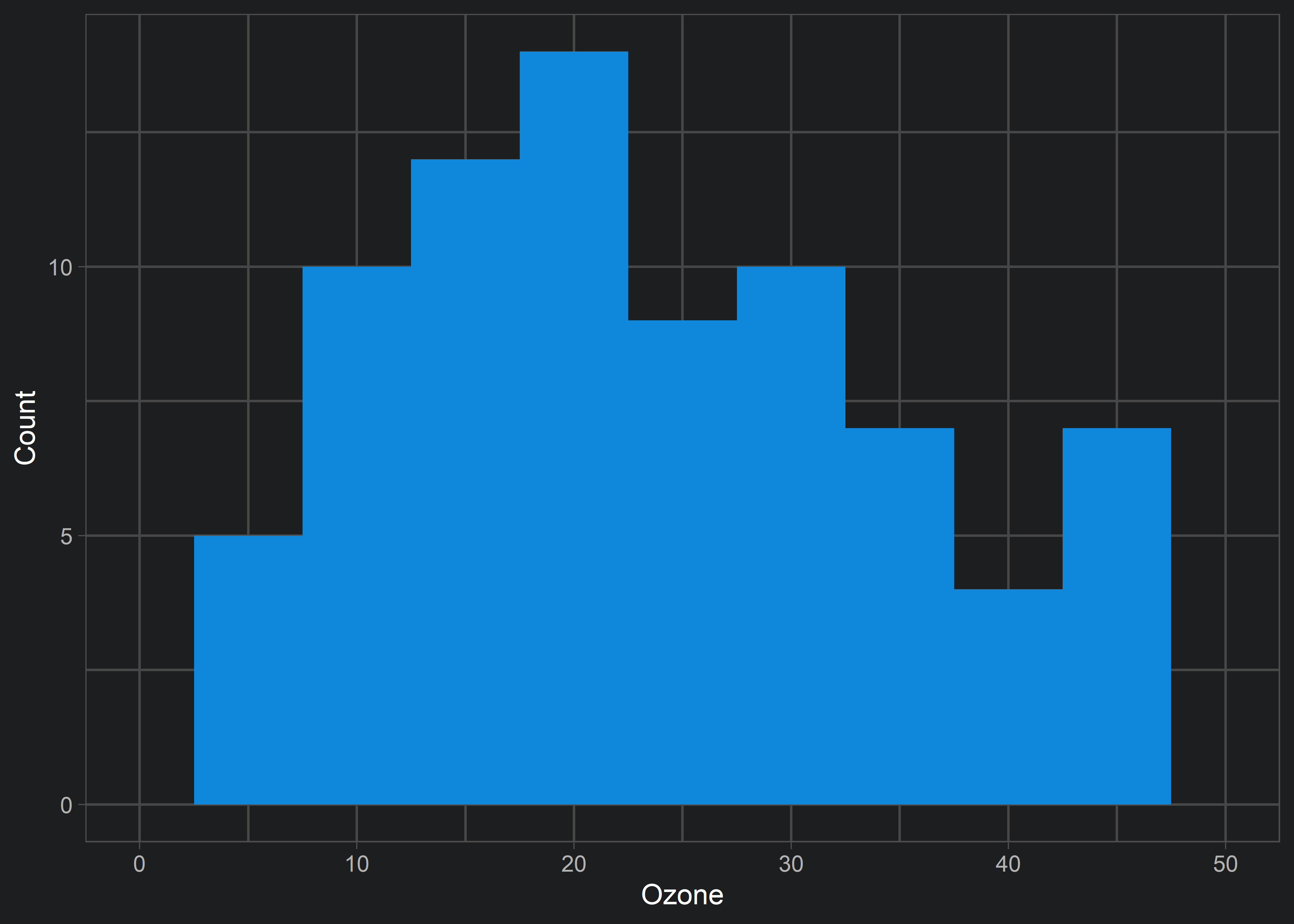
Instead, we can use coord_cartesian() to achieve a true “zoom in” on our original data visualization.
ggplot(aq, aes(x = Ozone)) +
  geom_histogram(fill = customBlue, binwidth = 5) +
  theme_light() +
  labs(y = "Count", x = "Ozone") +
  coord_cartesian(xlim = c(0, 50))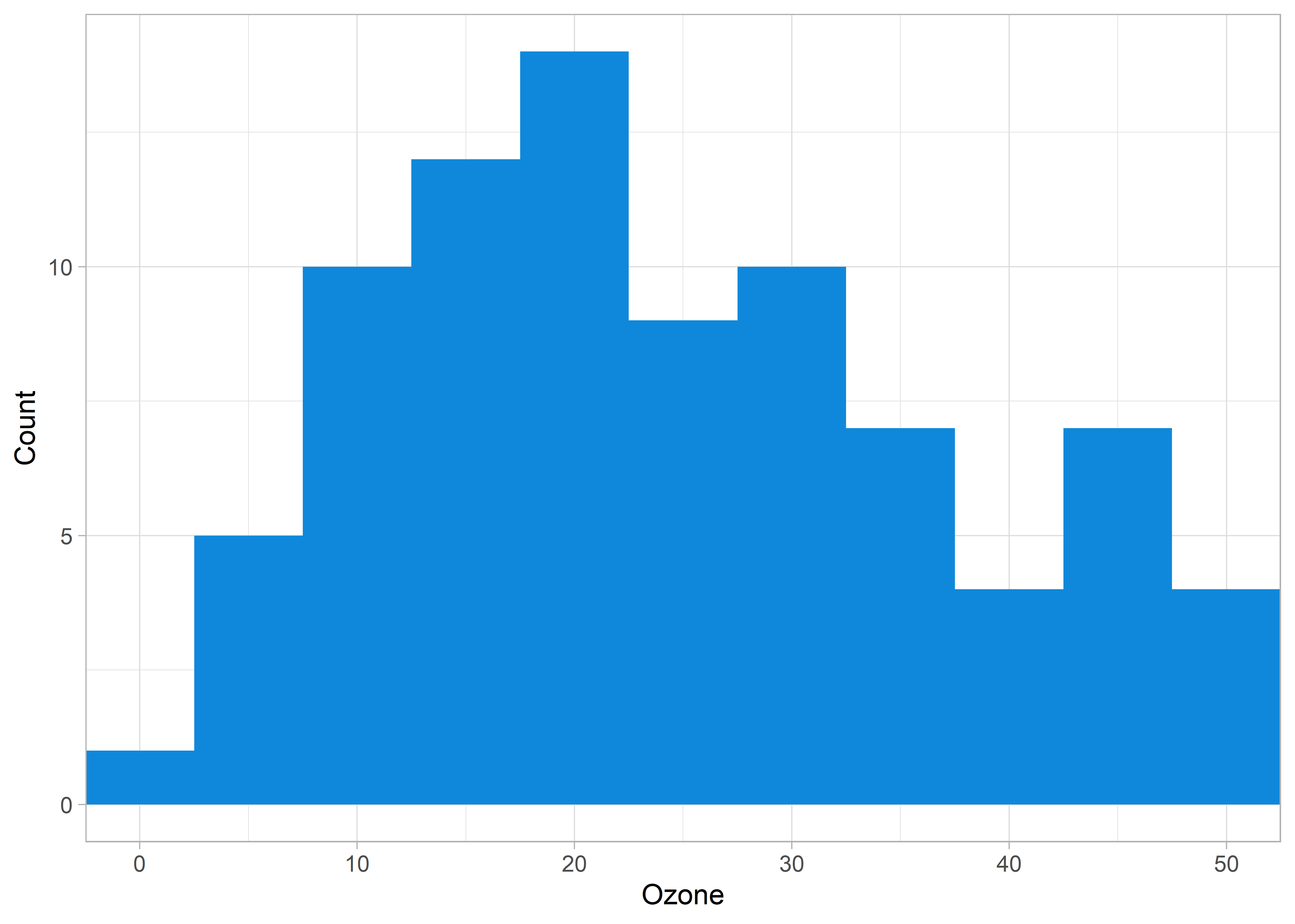
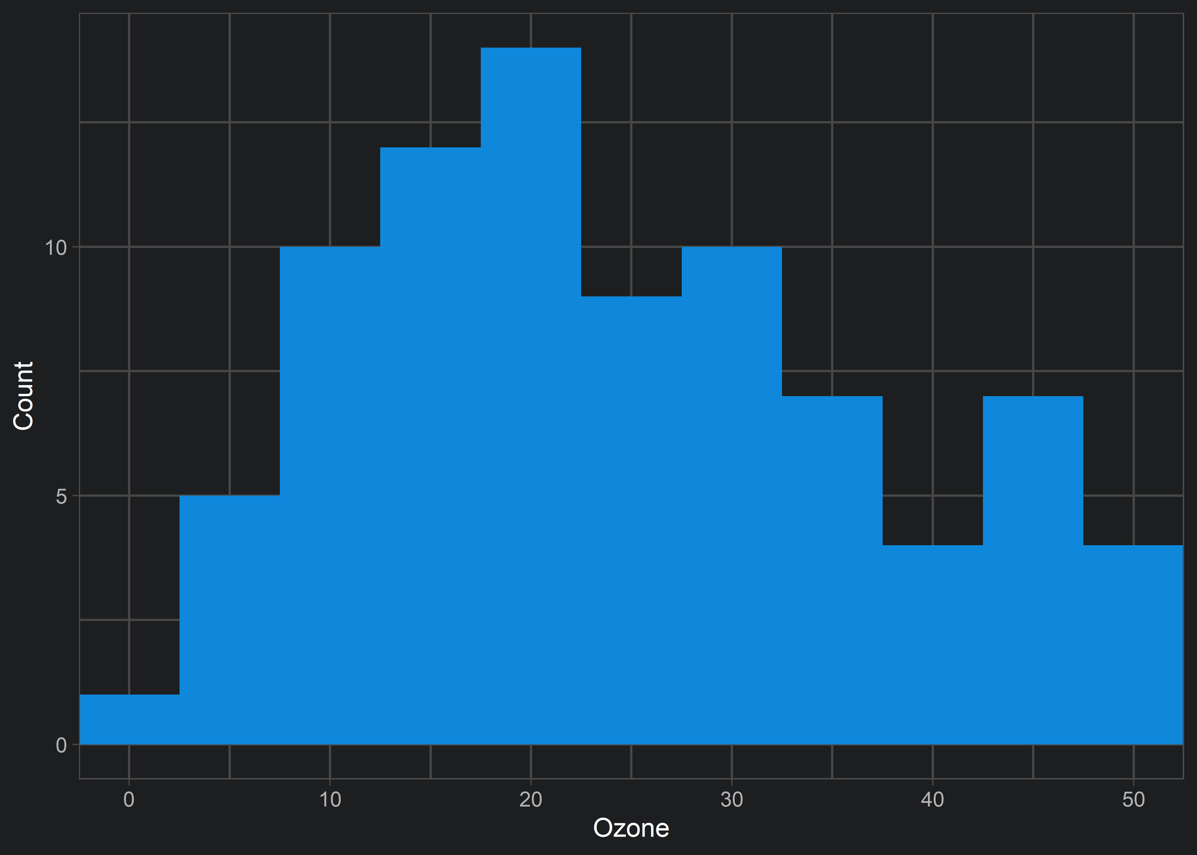
xlim argument within coord_cartesian() results in the desired behaviour. Note that the previous erroneous behaviour of xlim() isn’t restricted to histograms! Remember this tip so that you don’t accidentally exclude data from your visualizations!
3. Intra-figure legends in ggplot2 graphics
I agree with Edward Tufte’s disdain for legends in data visualizations. Legends, when placed on outside of a visualization, oblige your audience to look back-and-forth to interpret what you are presenting. This means that your audience has to focus on the format of your visualization before they can begin interpreting the content or message you are trying to deliver. That’s why I always try to use direct labels on my data visualizations instead of legends, like so:

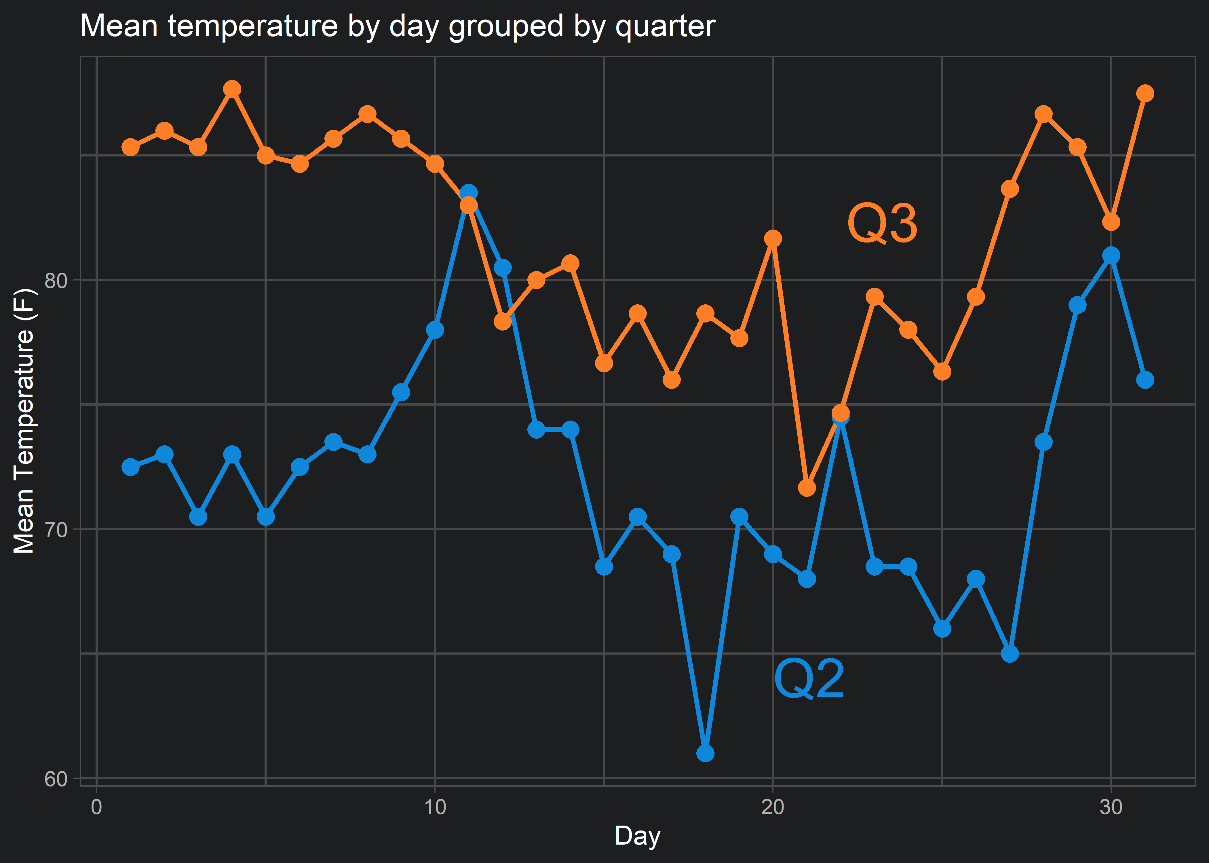
But say you want to do the same direct labelling with a messier or more complicated visualization…


aq %>%
  filter(Month != 5) %>%
  ggplot(aes(x = Day, y = Temp, group = Month, colour = factor(Month))) +
  geom_line(size = 1) +
  geom_point(size = 3) +
  scale_colour_manual(values = c(customBlue, customOrange, customYellow, customPurple)) +
  coord_cartesian(ylim = c(50, 100)) +
  labs(title = "Mean temperature by day grouped by month",
       y = "Mean Temperature (F)",
       colour = "Month") +
  theme_light() +
  theme(legend.background = element_rect(fill = alpha("transparent")),     ## These lines here!
        legend.key = element_rect(fill = alpha("transparent")),     ## These lines here!
        legend.position = c(0.25, 0.2),          ## These lines here!
        legend.title = element_text(size = 12),
        legend.text = element_text(size = 12))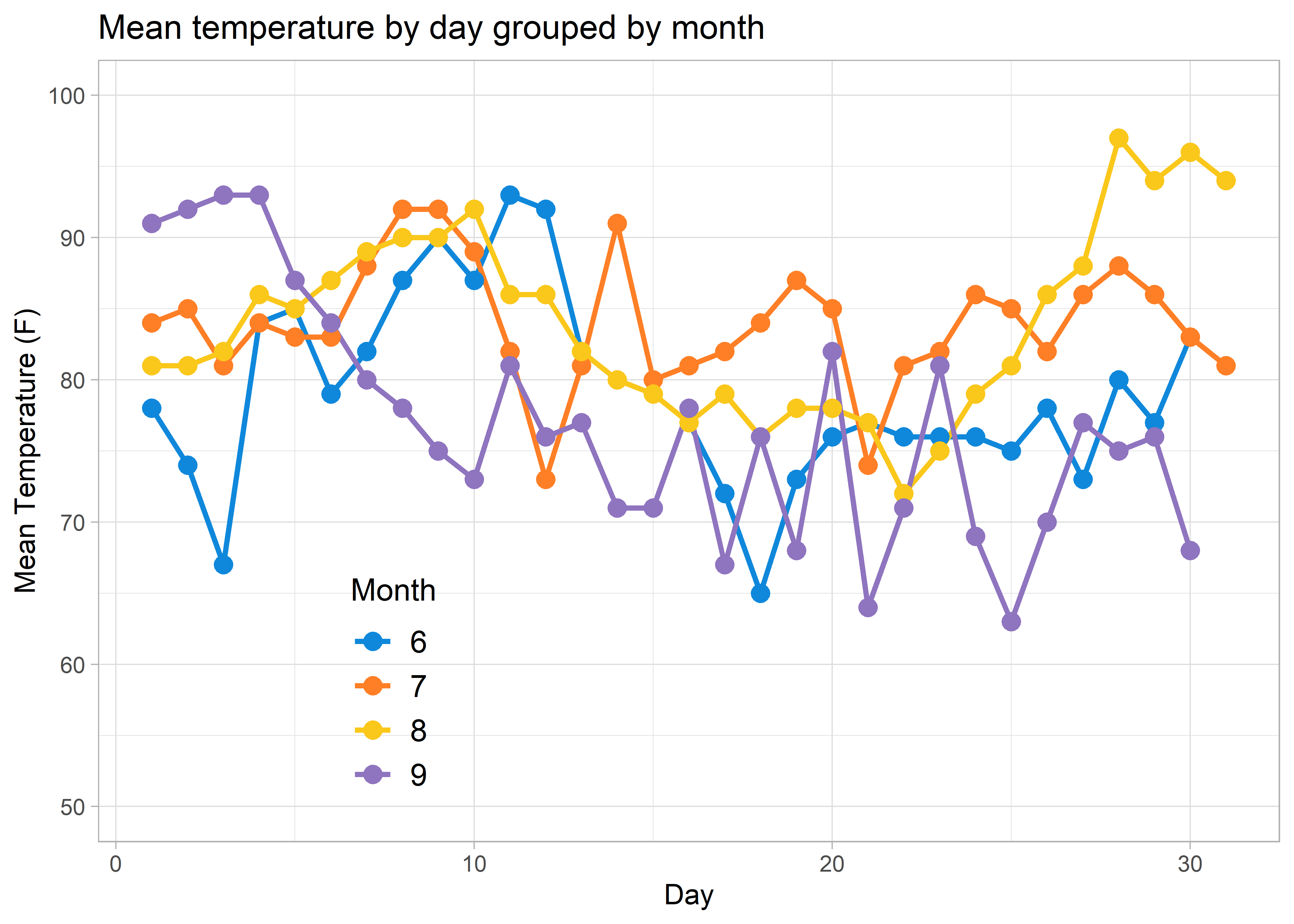
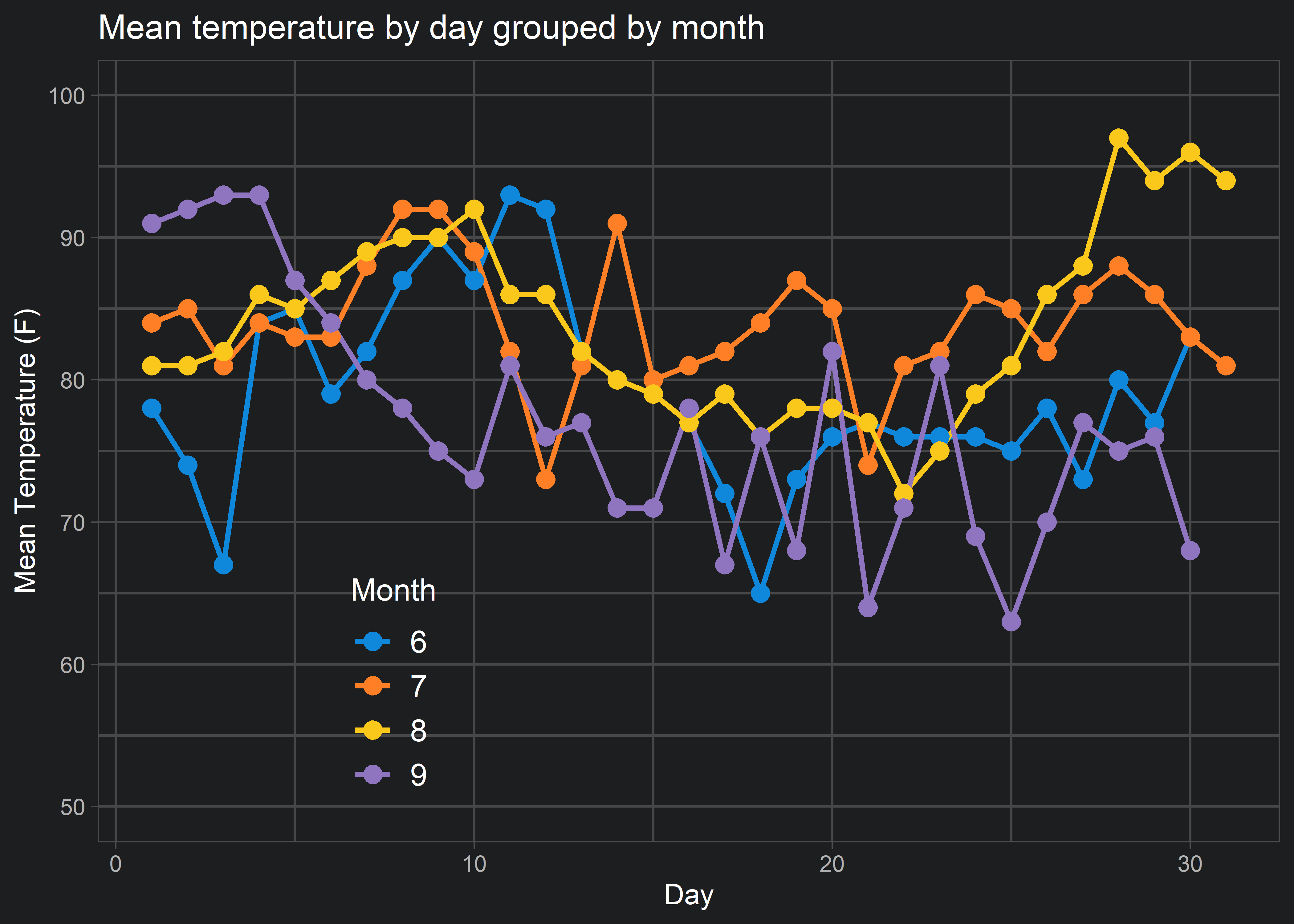
legend.background, legend.key, and legend.position arguments to make the legend background transparent and to move the legend into the figure. This intra-figure legend will reduce, but not eliminate all of the figure’s interpretability issues. At the very least, it is a good compromise when you can’t directly label your data.
4. High resolution plot outputs via CairoPNG()
Exporting graphics in R can be challenging. New users will typically use RStudio’s Export button in the Plots window to save images to their working directory. In my experience, this method results in pixelated, low resolution graphics. There is nothing more demotivating than working on a visualizations for hours, only to have them look mediocre when presenting them.
This is where the Cairo package comes in. The formula for generating Cairo outputs is as follows:
CairoPNG(filename = "filename.png", res = 300, units = "in", width = 16, height = 9)

ggplot()...

dev.off()- The first line initializes a graphics device via Cairo to render a high quality image of your visualization in the file format of your choosing. Here, I specify a PNG output through
CairoPNG(), but other formats include JPEG, TIFF, and PDF.
- The second portion of the script should contain your visualization code.
- The last part is specifying
dev.off(), which turns the graphics device off.
After executing the code in order, a high quality output of your visualization will be found in your working directory.
Note that your visualization might be slightly different from your viewer pane preview. It is then up to you to adjust your visualization code before running the whole code chunk again to see the changes. Use this tip so that your visualizations are always high res and crisp for your audience!
5. Fuzzy joins on date intervals with genome_left_join()
The last tip is for dirty data joining! You may find yourself in a situation where you want to join two data frames / tables but you don’t have the necessary number of unique identifiers. For example, you are looking at event data in two separate data frames, where one data frame contains subscription data and the other contains cancellation case data.
memberships## # A tibble: 8 x 4
## id sub_id start_date end_date
## <dbl> <dbl> <date> <date>
## 1 1 12 2019-09-05 2020-09-05
## 2 1 41 2018-09-05 2019-09-05
## 3 2 57 2019-07-01 2020-07-01
## 4 2 62 2018-07-01 2019-07-01
## 5 3 78 2019-02-01 2020-02-01
## 6 3 87 2018-02-01 2019-02-01
## 7 4 35 2018-05-25 2019-05-25
## 8 4 23 2017-05-25 2018-05-25cancellations## # A tibble: 3 x 4
## id case_open_date case_close_date retain
## <dbl> <date> <date> <lgl>
## 1 1 2020-05-09 2020-05-12 TRUE
## 2 3 2019-11-30 2019-12-01 FALSE
## 3 4 2018-04-25 2018-04-27 FALSE
In this example, we can identify which members have subscriptions and cancellation cases through id. But we don’t have enough information to know which subscription each cancellation case belongs to. To know this, we would need a unique subscription id variable in the cancellation case data. Unfortunately, we only have subscription ids in memberships. We can solve this problem with something called a fuzzy join.
In many programming languages, a left or right join allows you to link data frames or tables that contain a key identifier variable that is common between the two. This allows the analyst to link the data frames based on an exact match of the key id variables in each data frame. In our example, that would be the id variable. Fuzzy joins differ as they allow you to link data frames based on inexact matching. This inexact matching technique is particularly useful in combination with an exact match.
In the following example, we will use genome_left_join() from the fuzzyjoin package to perform a fuzzy left join of cancellations on memberships. This join will be based on criteria of an exact match of id and an inexact match of the subscription period (between start_date to end_date) that overlaps with the case period (between case_open_date to case_close_date).
# Convert start_date and end_date to numeric
memberships <- memberships %>%
                    mutate(start_date = as.numeric(start_date),
                           end_date = as.numeric(end_date))

# Convert case_open_date and case_close_date to numeric
cancellations <- cancellations %>%
                    mutate(case_open_date = as.numeric(case_open_date),
                           case_close_date = as.numeric(case_close_date))

# Fuzzy join
mem_canc <- memberships %>%
                genome_left_join(cancellations,
                                  by = c("id" = "id",
                                         "start_date" = "case_open_date",
                                         "end_date" = "case_close_date")) %>%
# Then convert start_date, end_date, case_open_date, and case_close_date back to dates
                mutate(     start_date = as_date(start_date),
                              end_date = as_date(end_date),
                        case_open_date = as_date(case_open_date),
                       case_close_date = as_date(case_close_date))
The first two code chunks change our subscription and case dates to integers (which represent the number of days since 1970-01-01). The result of the fuzzy join is a single data frame containing all rows from memberships and the matched rows of cancellations. Any rows in memberships that do not have a matching row in cancellations are filled with NAs.
mem_canc## # A tibble: 8 x 7
## id sub_id start_date end_date case_open_date case_close_date retain
## <dbl> <dbl> <date> <date> <date> <date> <lgl>
## 1 1 12 2019-09-05 2020-09-05 2020-05-09 2020-05-12 TRUE
## 2 1 41 2018-09-05 2019-09-05 NA NA NA
## 3 2 57 2019-07-01 2020-07-01 NA NA NA
## 4 2 62 2018-07-01 2019-07-01 NA NA NA
## 5 3 78 2019-02-01 2020-02-01 2019-11-30 2019-12-01 FALSE
## 6 3 87 2018-02-01 2019-02-01 NA NA NA
## 7 4 35 2018-05-25 2019-05-25 NA NA NA
## 8 4 23 2017-05-25 2018-05-25 2018-04-25 2018-04-27 FALSE
Now we can see which subscriptions the cancellation cases belong to. From here, I could further clean this data by changing the end_date of the subscription to match the cancellation case_close_date, if the subscription was successfully cancelled according to retain. This would allow me to calculate churn rates of the subscribers, which has huge implications for a subscription business’ monthly and annual revenue.
Note: to perform a fuzzy join with
genome_left_join()you will require theBioconductorandIRangespackages as well. Installation instructions can be found here.
Conclusion
Thanks for reading this blog post! Hopefully, you’ll be able to use some of these tips to make your data analyses cleaner, crisper, and more accurate!
Feel free to share this content with others who may benefit from using any of these tips. As always, the full code for this post is available here. Happy coding!