I recently attended Edward Tufte’s course, “Presenting Data and Information”, in Boston. I learned about the course through twitter after reading about Tufte, who is a professor emeritus of political science and statistics at Yale.
As a future business analytics student, I was very interested in a one day course taught by a data visualization expert. The most enticing factor was that it seemed to be the most design-focused course that I had read about. Most visualization courses I have taken emphasized the same type of material. Typically, when to use certain plots or how to generate those plots using code. I was more interested in learning about data visualization from a design standpoint.
My expectations were that the course would teach me
how to best implement data visualizations into presentations and reports
important guidelines, techniques or methods for how to design data visualizations
how to make my own data presentations more effective for my audience
Review of Tufte’s Course
The course is well-run. Assistant staff handle the logistics of the event and are generally well-organized. Refreshments and individual desk space were available to students. The course took place in a suitable venue (in Boston 2018, this was the Westin Copley Place Hotel). The attendees were a diverse group of researchers, students, and professionals. There were likely 400 people in total on the day that I attended the course.
Upon checking in, students receive
After receiving these materials, students complete readings before the first session begins. Readings are from three of the provided textbooks, which Tufte authored. As I finished the readings, I was quite excited to learn more about design in data visualization.
As the first session began, I had developed a first impression of the course. Tufte’s style of lecturing is somewhat divisive, since he has a tendency to lecture in circles. Other students sitting in my vicinity echoed this sentiment. While taking notes, I had to frequently trace back to where Tufte’s current point(s) belonged. Despite this, Tufte is succinct when lecturing the most important content. Tufte inserts his own humour into the lecture through sarcasm and does not shy away from discussing a wide variety of subjects (e.g. bringing notes to doctor’s appointments, the cruelty of bird artists, the state of medicinal research). At least he keeps it brief when he talks about tangential topics.
Throughout the course, Tufte showcases examples of good and bad information design. My favourite examples included:
an elegant scrolling music visualization
the National Weather Service’s website
a loading manual for a dish washing machine’s silverware basket
and a visualization from a New York Times article
Tufte also includes a controversial slide from NASA’s Columbia Disaster PowerPoint presentation. Previous criticisms of Tufte’s courses mention his interpretation of this particular slide. It was around this time that Tufte divulged his infamous distaste for PowerPoint. In short, Tufte believes that information displays should emphasize content holistically. PowerPoint’s format instead separates information into a hierarchy. In the end, this format tends to benefit the presenter rather than the audience. After the course, I learned that this is not the only time Tufte has had beef with Microsoft.
The first session ended with one of my favourite parts of the course: Tufte’s lecture on the Fundamental Principles of Analytical Design and Charles Joseph Minard’s Carte Figurative.

Wikipedia 2017. Original French language version of this visualization can be found here.
This graphic is celebrated as one of the most influential and visually dense information graphics of its time. Conveniently, it also exemplifies Tufte’s principles of analytical design.
Six Principles of Analytical Design
Show Comparisons
Show Causality, Mechanism, Structure and Explanation
Show Multiple Variables
Integrate Evidence
Document Credibility
Content Counts Most of All
Minard’s graphic satisfies these principles in several ways.
- Minard contrasts the size and direction of the army, temperature, longitude, latitude, and date information throughout the graphic.
- Minard integrates dates, locations, and temperature information alongside casualty data. This allows the viewer to assign the cause of infantry deaths to the declining temperature.
- The graphic visualizes six variables to reflect the complex nature of the events over time.
- Minard cites his sources; the names of credible individuals that saw the events themselves.
- The information and data are emphasized more than any other aspect in the graphic (e.g. formatting, scales, units).
Seeing these principles in action was the biggest design-centric takeaway from the course. I especially pleased to hear these principles spelled out so concisely.
Now that I know these principles, it is important to actually apply them to my own visualizations!
Thesis Visualization Revamp
As an exercise, I will use the principles mentioned above to improve a data visualization. Since finishing my master’s thesis, I have learned a lot about R and data visualization. Revisiting my thesis is a little painful since it only contains visualizations created in Excel. My thesis visualizations received feedback from many individuals, but many of their aspects can still be improved.
So here is a visualization from my thesis that I have chosen to revamp:
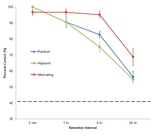
Figure 4. Spatial working memory accuracy in each arm pattern across increasing levels of RI. Spatial working memory was measured as a percentage of correct choices within the first four choices of the test phase. Errors bars represent standard error. Chance accuracy (41%) is denoted by the dotted line.
Note that I will not give context for the visualization by explaining the experiment. Instead, I want to focus purely on enhancing its design. If you would like to understand the data, feel free to refer to my thesis.
So first, let me outline what the visualization is doing right…
- Comparisons are shown across the three lines representing three different treatment categories
- The visualization shows the independent variable and grouping variable causing variation in the dependent variable
- The visualization contains multiple variables
Next, here are my issues with the visualization…
- Time is represented as a categorical variable on the x-axis, since the distance between retention intervals is not to scale
- The full range of possible values is not shown on the y-axis
- The colour labelling forces readers to look back-and-forth between the data and the legend
- The formatting obscure the data and exact values are hard to read
- The summary statistics obscure the underlying distributions of the data
I will not integrate the “Document Credibility” principle by citing sources. Since the data are from an original scientific experiment, I will instead document credibility by showing the underlying distribution of the data (via jittered, translucent points). This way the audience will see the raw and summary data simultaneously so they can form their own interpretations from both.
So let’s improve this visualization!
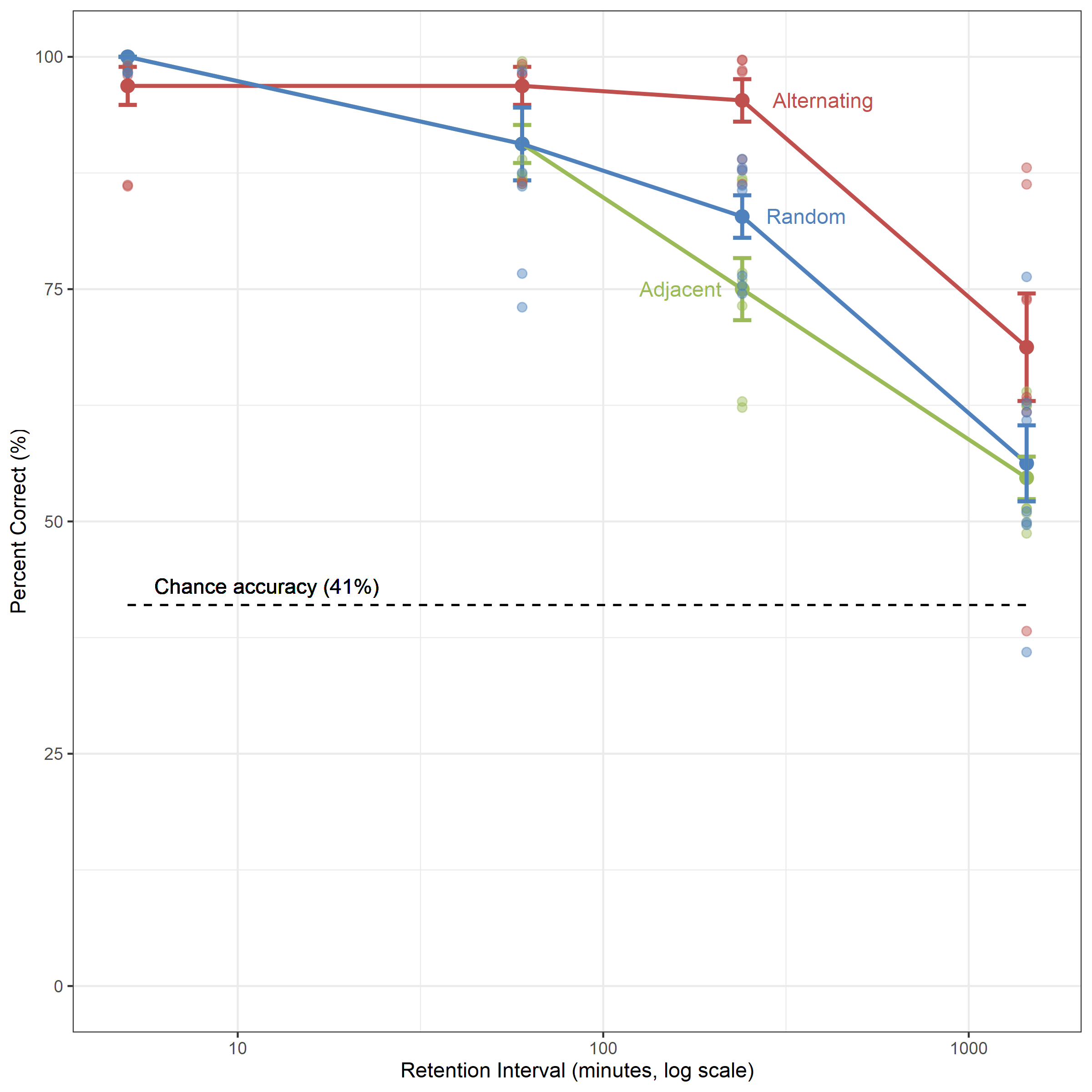
Figure 4. Spatial working memory accuracy in each arm pattern across increasing levels of RI. Spatial working memory was measured as a percentage of correct choices within the first four choices of the test phase. Errors bars represent standard error. Jittered, translucent data points represent individual observations at each RI. Chance accuracy (41%) is denoted by the dotted line.
In this new version of the graphic, many of the original issues have been addressed.
- Time is now represented as a continuum, with the levels of the x-axis variable represented on a log scale
- The y-axis shows the full range of possible values
- The legend was replaced by direct labels. These labels help the audience interpret differences across categories
- Formatting and axes are cleaner and the grid improves tracking of exact data values
- Summary statistics and the underlying distributions are shown simultaneously to tell the whole story
Overall, the visualization does not look drastically different. The little changes have improved the graph’s accessibility and efficiency in communicating information. This exercise reinforces how “the devil is in the detail” when designing effective data visualizations. Furthermore, communicating information efficiently is a valuable skill that requires practice. Practicing simple changes that help you communicate that information will yield massive rewards.
Conclusion
To review, my expectations were that the course would teach me
how to best implement data visualizations into presentations and reports
important guidelines, techniques or methods for how to design data visualizations
how to make my own data presentations more effective for my audience
Tufte’s course met my expectations because its content directly addressed what I wanted to learn. Tufte’s specific advice about data visualization outweigh my few criticisms of the course. This blog post only covers one large insight I learned in Tufte’s course. There is still much more to learn about data visualization best practices. If attending the course is convenient and affordable for you, I would recommend it. If the course is not an option for you, I would suggest reading Tufte’s textbooks, which are surprisingly affordable.
Also, go to Boston. It is easily my favourite American city so far.

As always, the code for this post is available here.